1.1 KiB
1.1 KiB
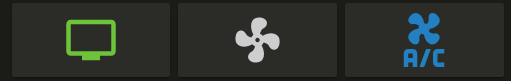
Button card
Button card is a simple button card to toggle your entities.
The card toggles on click/tap.
Options
| Name | Type | Default | Description |
|---|---|---|---|
| type | string | Required | custom:button-card |
| entity | string | Required | switch.ac |
| icon | string | optional | Icon to display in place of the state e.g. mdi:air-conditioner |
| color | string | var(--primary-text-color) |
Color of the icon when state is on. Can be any html color e.g. rgb(28, 128, 199) |
| size | string | 40% |
Size of the icon. Can be percentage or pixel |
Examples
Import the card in ui-lovelace.yaml
title: Home
resources:
  - url: /local/button-card.js
    type: module
Show a button for the air conditioner (blue when on):
- type: "custom:button-card"
  entity: switch.ac
  icon: mdi:air-conditioner
  color: rgb(28, 128, 199)
Show an ON/OFF button for the home lights:
- type: "custom:button-card"
  entity: group.home_lights